You might have been wondering where I've been for the last few weeks, so I thought I'd show rather than just tell. I rarely talk about specific 'daytime' projects I work on, but I guess I'm quite proud of this one and you might be interested in what we've done. I've been working with LBi (Europe's biggest design/technology agency) recently, leading a team of 5-7 developers on a WCM (Web Content Management) project for one of the global investment banks. You can see some aspects of what we've done with SharePoint in this post, and I'll follow up with some developer-to-developer info about techniques we used in the next one. Additionally, for UK-based folks I think Riaz Ahmed (my current boss and Mr SharePoint at LBi) is hoping to do a real show and tell at the UK SharePoint user group in a couple of months, where there'll be the opportunity for Q&A and to pick up far more info/lessons learnt (both technical and non-technical) than I can provide here.
The site is targeted at a closed audience over the internet (our client's clients), so unfortunately you can't see it for yourself - the site provides analysts with high-value information on financial markets, primarily in the form of market reports and newsflashes, though there are other content types. The user experience we were tasked with implementing (created by LBi's design team) means the user gets to have some pretty impressive functionality around all this (IMHO) which differentiates the service from others.
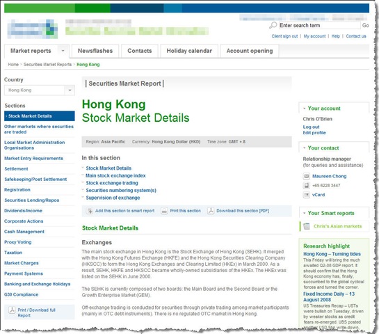
The centrepiece is the market report data, which is held for many countries and topics:
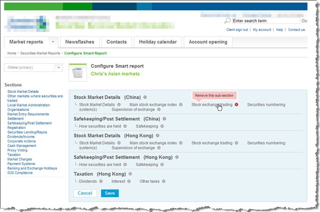
This is imported nightly from a master datasource (thus lending itself nicely to caching), and our client can also add comments to the imported data via SharePoint WCM page editing. Perhaps the slickest piece of functionality is the facility for the user to create personalized 'smart reports' with specific markets and topics which interest him/her. These are saved against the user's profile for quick access:
At runtime we build the personalized page from the same cache layer used by the standard pages in the first shot.
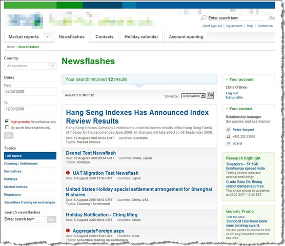
Since financial markets change quickly, our client's authoring teams (distributed around the world), can quickly create newsflashes via SharePoint publishing functionality for display on the site - this is controlled via SharePoint workflow. Users can search and filter by country, date, high priority flag and can also store in a 'My newsflashes' bucket for quick retrieval:
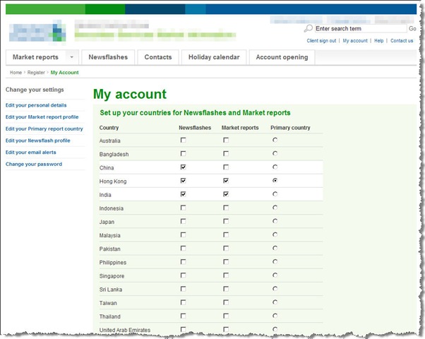
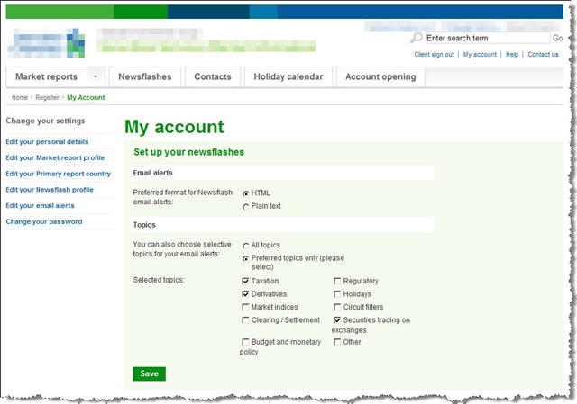
Users also have the option of receiving e-mail alerts when newsflashes are added to the site (immediate for high priority newsflashes, nightly batch for others), and can tailor their e-mail preferences by country...
..and topic:
The site also has a ton of other good stuff, such as:
- single sign-on with a sister site
- integration with a higher-level portal which can authenticate users itself (meaning users do not log-in separately on our site)
- WCAG 'A' -level accessibility - accessibility wasn't particularly a focus of the client for this site, but (happily) is just how things are done here anyhow. We use a lot of JavaScript to enhance the user experience but it always provides equivalent functionality when disabled - I have to say the LBi front-end developers use some incredibly innovative techniques to achieve this, I've rarely seen anything like it (see below for some examples).
- integration with Endeca for search (including the newsflash landing page you see above - this is powered by search)
- custom admin functionality for user creation/management
- many many smaller but 'interesting' requirements such as newsflashes having user-selected 'related items', attachments etc etc!
Rich, accessible controls
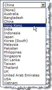
In addition to all the personalization, one of the things that I love about the user experience is the funky controls we have. So why have a dull dropdown like this:
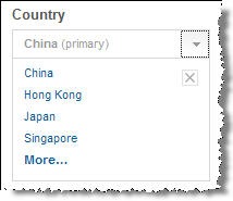
...when you can have one like this:
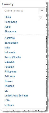
This allows us to present only countries the user has told us they are interested in in the dropdown (thus avoiding clutter), whilst allowing them to easily see data for other countries if they have the occasional need to. To do this, clicking the 'More...' link expands the dropdown to show a second section containing the other countries (or more specifically, the other countries they are permitted to see):
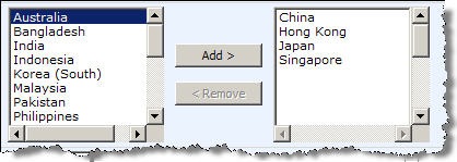
Similarly for multiple selections, why have this:
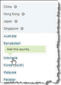
...when you can have this:
Again, clicking the 'More...' link allows the user to select a country not in their 'preferred' countries:
Personally I think this makes for a great user experience, and it's all accessibility-compliant.
Project plan : caffeine
The development time for everything you see here (and everything you don't) was around 7-8 weeks, though this excludes some of the front-end development (HTML, CSS, JS). We're not quite over the finishing line yet, but are in the final stages of user acceptance testing and security testing. To say it's been tough would be something of an understatement, but I'm incredibly proud of my guys and it's been a great team effort - fortunately for me they're very talented :-)
Next time I'll detail some of the technical decisions we took and go through some developer bits which we felt worked well when building/deploying the site.



8 comments:
this is insane . I like all the Ui stuff. How many people in 7-8 weeks ?
Rohan,
It varied slightly over the course of the project, but in total we used 5-7 guys - myself and 4 other SharePoint devs, an Endeca guy and an interface developer (front-end guy).
You'll have to believe me when I say we were going at full tilt though :-)
Cheers,
Chris.
I'm currently working on a project that will be maintained by authors around the country, and this is the first I've seen of use MOSS in an envirornment for users who are not in one centralized area.
What method of authentication did you use for this? Was it just the forms-based sqlmembership store, or did you guys create your own memberhip? I'd love to know more about how you handled the single sign-on with a sister site (not MOSS-based, I would assume). Any chance you'll be writing a blog on this?
slp,
Maybe I can answer here - you kind of hit upon some of the complex issues in a way. In actual fact, we authenticated users against a SharePoint list with a custom provider, but this was forced on us (wouldn't have been my choice under all the circumstances, and the plan is to change this fairly soon). The reason this was forced on us is actually to support the single sign-on - the sister site (also on MOSS) already existed and authenticated users in this way. For us to provide single sign-on with the same username and password, we effectively need to use the same authentication provider. In terms of the single sign-on itself, this is actually handled by .Net cookie sharing, and means that users can pass authenticate against one site and pass between each without being reprompted to login. All good.
One of the reasons we're looking to change the authentication model is because it kind of works for 2 sites, but in the future we might have 20. In this scenario, we'll have many more users and certain issues arise (scale, performance, slightly unorthodox design of authentication store being tied to one site) which mean SQL authentication is a better choice IMHO. In addition, we currently require some fairly intelligent code for creating users which deals with creating the user, creating a default profile, assigning to correct security groups in each site, and rationalizing the way we deal with authentication and profiles should hopefully simplify this picture somewhat.
In short, the kind of issues which can crop up with multiple sites, many users, and heavy use of user profiles. But that's the interesting stuff right? ;-)
HTH,
Chris.
P.S. If you have further queries let me know and I'll try to give more details.
Interested to know what javascript libraries you chose to use on your project.
LBi - wow I work just up the road in Fashion street - should get together for a drink.
Saul
Hey Saul,
We didn't use AJAX (no specific need to), but our interface developer did use the jQuery JavaScript library, and I think this is in common use at LBi.
Sure, I'd be up for a drink sometime :-)
Take care,
Chris.
Chris,
Can you share the project plan/task list that was used for this project? We're starting to build a WCM site with Endeca integration, so the project plan will be extremely useful.
Thanks!
-Raj
Hi Raj,
Sorry, I no longer have access to these documents.
All the best with your project..
Chris.
Post a Comment